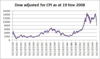
My independently-researched version:
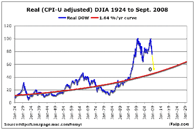
 iTulip's:
It's really hard to see the past in our own terms. I'm trying to do it using the Consumer Price Index, which opens another can of worms about the composition and weighting of that index, especially since (I understand) it affects government statistics and benefits. However, you have to start somewhere.

The first thing to note is how freakish recent years have been. If you connect previous start-of-month highs (August 1929, January 1966) and extended the line, you'd expect the recent Dow highs of 1999 and 2007 to be no more than 10,000 points.
And as for the lows: the drop from 1929 to 1932 was 86% "in real terms"; from 1966 to 1982, 73%; and so far since 1999, 46% - but this last from an amazing historical high. And the 350%-plus American debt-to-GDP ratio is quite unprecedented.
So the history of the last 80 years offers no clear guide as to what could happen next. If proportionately as severe as 1932, the Dow could dive to about 2,100 points; if like 1982, just below 4,000. BUT the second of these great waves crashed rather less than the first, so maybe the third will be even more merciful, perhaps a top-to-bottom fall of only 60%, i.e. end up at c. 5,900.
I note that the Dow has closed tonight at 7,552.29. What a fast fall we've seen - will it spring back sharply and then recommence its decline, as in previous cycles, or is it popping like a balloon?
Methodology
I've noted the Dow as it stood on the first trading day each month, starting October 1928 and ending November 2008 (plus where it stood yesterday - 7.997.28 - since we've seen a further steep fall). Then I've noted the historical CPI as at the end of the previous month in each case. Then, looking at the latest Dow figure, I've adjusted historical Dow figures accordingly (i.e. Dow then/CPI then, times CPI now).
Sources: Dow: Yahoo! Finance; CPI: InflationData.com
UPDATE
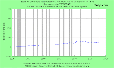
iTulip today also reproduces its graph on holdings at the Federal Reserve bank, underscoring the point that the current crisis has features that we can scarcely compare to anything in the last 80 years. Except that it's unlikely to be good news.

No comments:
Post a Comment