Obviously, this isn't exactly news - a quick Google leads me to this book by Alicia Haydock Munnell, where she says "The long-run negative correlation between stock prices and the rate of inflation has been confirmed in several statistical studies." Yet another academic study says "The bivariate results for the real stock returns-inflation pair weakly support a negative correlation in the 1970s and 1980s."
But what if we compare real stock prices with changes in the inflation rate? So I've done something childishly simple - perhaps childishly wrong, I await your correction:
First ("L2/J2"), I divided the FTSE index by the RPI index (end December figures in both cases); since the FTSE has grown in real terms by only about 1.6% p.a. since 1970, I think this should reduce some of the statistical noise - in effect, we have the inflation-adjusted value of the FTSE for each year end.
Then I looked at how much the RPI index had changed, year on year, expressed as a percentage.
Then I used Excel to calculate the correlation between the two sets of data. The figure (as you see at the bottom of the sheet) is (0.711). I may be mistaken but I think this shows that there is a strong negative correlation between changes in the inflation rate, and changes in the inflation-adjusted capital value of the FTSE.
(By contrast, the correlation between the annual percentage increase in RPI, and the annual percentage increase/decrease in the FTSE, is only 0.275576.)

Thinking about this, it would make sense: when inflation starts roaring away, investors will want better yields on stocks, so (as with bonds) the value of stocks needs to fall. The question is, how long does it take for the dividends to compensate for the capital loss, to someone who held the shares before the major inflationary period began?
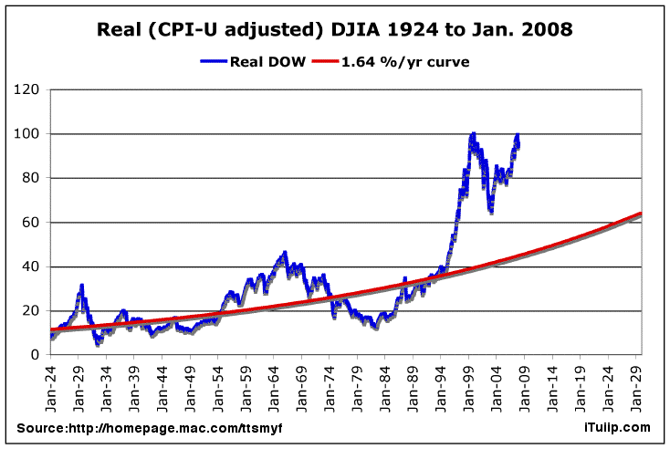
Maybe the sales line that stocks are a long-term hedge against inflation, is only half-right: it'd pay even better (when inflation begins smouldering) to switch out of cash, bonds and stocks and into other stores of value (such as commodities and houses), and come back again when the inflationary fire looks as though it's been brought under control. Look at the real capital values of the Dow and FTSE in these graphs, and imagine you had stayed out for a decade or more, then jumped in with your portfolio in the early 80s, or mid 90s.
But speculators have already gotten into commodities, and (thanks to greedy banks and lax governments) houses are massively oversubscribed. Nevertheless, commodities may yet be a better long-term punt than the average investment at this stage, and there are those who will argue the case for good agricultural land. So maybe there's still an opportunity to get on the cruise ship, even if we've missed the speedboat?
It's so difficult when, as Marc Faber says, for the first time we're in a world-wide bubble. This nasty combination of monetary and fiscal crises has us running in all directions.
UPDATE
Yes, I've got my methodology wrong, as my brother has pointed out. So I'm back to the simpler, positive (real, but not so strong) correlation between percentage changes in the FTSE and the RPI: 0.275576. Interestingly, the correlation is very slightly better (about 0.285), if you look at the FTSE 12 months ahead of the RPI.
It's just that, visually, the inflation "mountain" of the 70s and early 80s seems to want to turn upside down and fill the inflation-adjusted "crater" of the FTSE in the same period. But at least there is a definite correlation, over the series as a whole from 1971-2007.


