Karl Denninger just gets better - it's one of the advantages of sticking to your theme and endlessly rehearsing your arguments, as politicians know.
There is only one way that home prices where they are, even today, are sustainable - that would be for wages to rise by 30% across the board. That, of course, isn't going to happen, and if it did it wouldn't do you a bit of good because prices would simply rise to the same degree, leaving us exactly where we are now!..
There never was a "boom" in earnings power for middle America. The median family income - including all quintiles - was actually down $500 or so over the last eight years. If you exclude the top quintile it was down materially - 5% or so. And that's in nominal, not constant, dollars...
We're now going to adjust spending and investment levels to incomes because there is no way for us to adjust incomes to spending levels! The big productivity gains that came from computerization are finished, and we've already offshored nearly all of our manufacturing, so there's no more "cheap labor improvement" available either...
If we can keep the government from screwing things up with more vote-buying attempts we'll get through the other end of this, although people's standards of living will change. You won't be able to afford to milk your house for the second Lexus and six plasma TVs, but is this really such a disaster? I think not.
Read the whole thing in all its beauty here.
Next task, when I have the time, is to see what happened to the middle quintiles in the UK.
Thursday, April 10, 2008
Monday, April 07, 2008
It really, really is a swindle
I am grateful to James Higham for directing me to this article by a very distinguished economist, explaining the scam of fractional reserve banking. Even when you understand how it works, you find it difficult to believe; it's a bit like finding out how babies are made, looking at your parents, and... naaaaah!
Where are the police?
UPDATE
I've been directed (see comments) to this video, "Money as debt", by Canadian Paul Grignon:
Here are the artist's own comments; here's the dedicated website; here's his professional artist's website; and here's a link to the Idaho Observer, with a little extra detail on the making of the film - cut off the last part of the address to see more of the Observer's output.
Whether it's right or wrong, simplistic or not, I'm heartened to see practical idealism like this.
FURTHER UPDATE
Karl Denninger explains why the money-lenders won't permit inflation to run away and destroy the basis of their wealth. And why this means the economy will hit the buffers.
If history repeats itself
A few days ago, I looked at the Dow over the past 40 years and concluded that, on average, the real growth rate was very close to the very long-term historical norm.
What I didn't think to do then, is to illustrate the shape of the Dow if it continues to be as volatile as in the last 40 years. So here goes - same average growth, same inflation rate etc:
What I didn't think to do then, is to illustrate the shape of the Dow if it continues to be as volatile as in the last 40 years. So here goes - same average growth, same inflation rate etc:
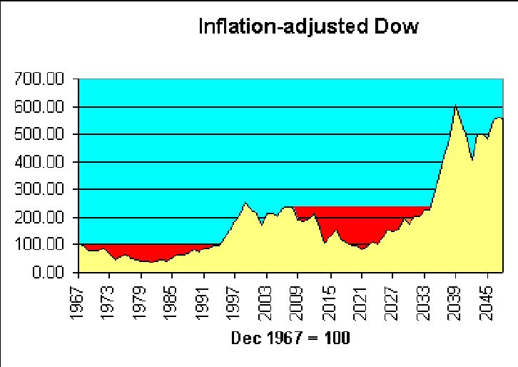 It's the volatility that does you in. As Keynes said, "In the long run..."
Matter of fact, if history repeats itself, there's a point around 2021 where in real terms, we're behind where we were in 1967. This time, I will buy beads and wear flares. I'd still be younger than Robert Graves was last time round.
Chirpy
Don Boudreaux is an economist, yet although an expert in the "dismal science", he is an optimist, which makes a very nice change. He claims it's because he's a professional in the field.
Here he says that America's freedom and creativity will overcome present problems, as they have in the past; here he says the housing market can't be too bad if workers are unwilling to sell their houses in a falling market; and here he claims to love America's trade deficit.
Is he right? Or just seeing affairs from the point of view of a man who's had a good dinner and is assured that, in his case, good dinners will never stop coming? I've often thought that war movies should end prematurely and at different points for a random selection among, say, 20% of the audience, to remove the Olympian perspective.
But it is nice to read someone who thinks it's not all gloom and doom.
Sunday, April 06, 2008
Banks, usury and slavery
In the UK, GDP is said to trend long-term to an increase of around 2.5% per year, hence also the Monetary Policy Committee's figure for inflation target-setting.
Since 1963, the M4 money supply has grown by an average of slightly under 13.5% per year. So that would be about 11% p.a. relative to GDP.
This means that bank lending, as a proportion of GDP, doubles every 7 years.
How long can this continue? How long before we are completely robbed and enslaved? Or am I asking a fool's question?
Saturday, April 05, 2008
Awaiting the caning
 Karl Denninger reports here that the Dow's price-earnings ratio may be overestimated by a factor of 4. And here, that financial institutions will have to bring Structured Investment Vehicles back onto their books within 12 months.
The reckoning - the painful correction - approaches.
Doug Noland (April 4) agrees:
It is my view that our economy will require a massive reallocation of resources. We will have to create much less non-productive (especially mortgage and asset-based) Credit and huge additional quantities of tradable goods. In the “services” sector, there will no choice but to “liquidate” labor and redirect its efforts. Throughout finance, there will be no alternative than to “liquidate” bad debt, labor and insolvent institutions – again in the name of a necessary redirecting of resources. After an unnecessarily protracted boom, there will be scores of enterprises that will prove uneconomic in the new financial and economic backdrop. “Liquidation” will be unavoidable.
Will our wise leaders in the UK learn from this?
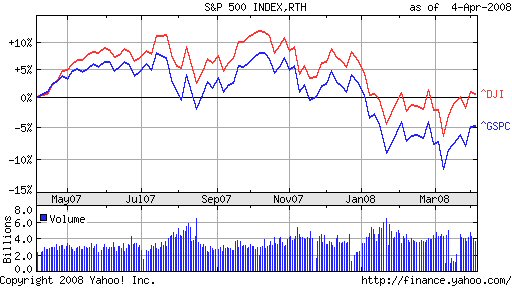
P.S. How come (Denninger, here) the Dow p/e appears out of whack by 53:13, but the S&P 500 only 20:14? The latter implies only a possible 30% drop, which is a bit less apocalyptic than the 75+% of the Dow!
Generally the Dow and the S&P have followed similar trajectories over various periods, with a little widening in the last 12 months:
Friday, April 04, 2008

Thursday, April 03, 2008
Fishy business in the gold market
Contrarian Investor reports that gold is being loaned out at negative rates of interest, which he thinks is in order to help short the gold market. There's a manicured thumb on the scales, it seems.
Does asset inflation help support stock prices?
An anonymous comment on the preceding post has set me speculating further. The commentator says:
You are right, but I believe that this time around it will be equities, rather than commodities or real estate that will provide the hedge against coming inflation. Tobin's Q will prevail due to the juxtaposition of equity prices vs. the other two asset classes (which already had their surges) and the market's increasing valuation sophistication compared to the last time we saw hyperinflation in developed economies (i.e. the 1970s). So I've been buying stocks as an inflation hedge, despite the statistical evidence that this is foolish...
Wikipedia offers an explanation of Tobin's Q here. Essentially, Q is a measure of the relationship between the value of all a company's shares, and the value of the company's assets. If Q is greater than 1, there is some reason (real or imaginary) why the company has extra value to offer; if less than 1, a share investor could buy a company's underlying assets at a discount.
In 2006, Michael Alexander wrote a series of articles for Safe Haven, about stock cycles. Below, from the second in the series, is his graph for Q in several bear markets, including the one which he suggests began in 2000:
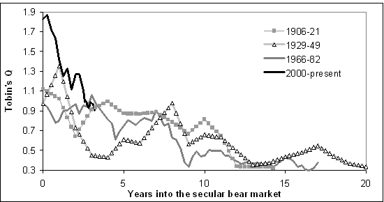
According to this, Q was already below 1 in 2006, and since the market is now back to about where it was a couple of years ago, that would suggest that shares are now fairly valued in relation to company assets.
But if history repeats itself, the current bear market has a long way to go, since the other three lasted 15 - 20 years. And in each of the previous cycles, Q slumped below 0.4.
Another complicating factor, thanks to the lending boom, is the real estate bubble. Steve Moyer is firmly of the opinion that real estate is very heavily overvalued, even now. So a collapse in that market would push Tobin's Q back up for many companies, a technical indication that share prices would have to drop steeply to get back to fair value (let alone overshoot to below Q=0.5).
In this context, it's worth noting that one of Mike Alexander's books, published in 2000, is titled "Stock Cycles: Why stocks won't beat money markets over the next twenty years".
Wednesday, April 02, 2008
Is inflation negatively correlated with real stock values?
I'm aware that I'm setting myself up to be laughed at by the quants, but I'm playing a hunch. The FTSE graphs I've done over the last couple of days suggested to me that periods of high inflation are bad news for stock prices, as well as for cash.
Obviously, this isn't exactly news - a quick Google leads me to this book by Alicia Haydock Munnell, where she says "The long-run negative correlation between stock prices and the rate of inflation has been confirmed in several statistical studies." Yet another academic study says "The bivariate results for the real stock returns-inflation pair weakly support a negative correlation in the 1970s and 1980s."
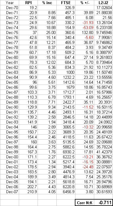
But what if we compare real stock prices with changes in the inflation rate? So I've done something childishly simple - perhaps childishly wrong, I await your correction:
First ("L2/J2"), I divided the FTSE index by the RPI index (end December figures in both cases); since the FTSE has grown in real terms by only about 1.6% p.a. since 1970, I think this should reduce some of the statistical noise - in effect, we have the inflation-adjusted value of the FTSE for each year end.
Then I looked at how much the RPI index had changed, year on year, expressed as a percentage.
Then I used Excel to calculate the correlation between the two sets of data. The figure (as you see at the bottom of the sheet) is (0.711). I may be mistaken but I think this shows that there is a strong negative correlation between changes in the inflation rate, and changes in the inflation-adjusted capital value of the FTSE.
(By contrast, the correlation between the annual percentage increase in RPI, and the annual percentage increase/decrease in the FTSE, is only 0.275576.)
Obviously, this isn't exactly news - a quick Google leads me to this book by Alicia Haydock Munnell, where she says "The long-run negative correlation between stock prices and the rate of inflation has been confirmed in several statistical studies." Yet another academic study says "The bivariate results for the real stock returns-inflation pair weakly support a negative correlation in the 1970s and 1980s."
But what if we compare real stock prices with changes in the inflation rate? So I've done something childishly simple - perhaps childishly wrong, I await your correction:
First ("L2/J2"), I divided the FTSE index by the RPI index (end December figures in both cases); since the FTSE has grown in real terms by only about 1.6% p.a. since 1970, I think this should reduce some of the statistical noise - in effect, we have the inflation-adjusted value of the FTSE for each year end.
Then I looked at how much the RPI index had changed, year on year, expressed as a percentage.
Then I used Excel to calculate the correlation between the two sets of data. The figure (as you see at the bottom of the sheet) is (0.711). I may be mistaken but I think this shows that there is a strong negative correlation between changes in the inflation rate, and changes in the inflation-adjusted capital value of the FTSE.
(By contrast, the correlation between the annual percentage increase in RPI, and the annual percentage increase/decrease in the FTSE, is only 0.275576.)

Thinking about this, it would make sense: when inflation starts roaring away, investors will want better yields on stocks, so (as with bonds) the value of stocks needs to fall. The question is, how long does it take for the dividends to compensate for the capital loss, to someone who held the shares before the major inflationary period began?
Maybe the sales line that stocks are a long-term hedge against inflation, is only half-right: it'd pay even better (when inflation begins smouldering) to switch out of cash, bonds and stocks and into other stores of value (such as commodities and houses), and come back again when the inflationary fire looks as though it's been brought under control. Look at the real capital values of the Dow and FTSE in these graphs, and imagine you had stayed out for a decade or more, then jumped in with your portfolio in the early 80s, or mid 90s.
But speculators have already gotten into commodities, and (thanks to greedy banks and lax governments) houses are massively oversubscribed. Nevertheless, commodities may yet be a better long-term punt than the average investment at this stage, and there are those who will argue the case for good agricultural land. So maybe there's still an opportunity to get on the cruise ship, even if we've missed the speedboat?
It's so difficult when, as Marc Faber says, for the first time we're in a world-wide bubble. This nasty combination of monetary and fiscal crises has us running in all directions.
UPDATE
Yes, I've got my methodology wrong, as my brother has pointed out. So I'm back to the simpler, positive (real, but not so strong) correlation between percentage changes in the FTSE and the RPI: 0.275576. Interestingly, the correlation is very slightly better (about 0.285), if you look at the FTSE 12 months ahead of the RPI.
It's just that, visually, the inflation "mountain" of the 70s and early 80s seems to want to turn upside down and fill the inflation-adjusted "crater" of the FTSE in the same period. But at least there is a definite correlation, over the series as a whole from 1971-2007.


Tuesday, April 01, 2008
Panic overstated?

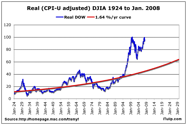
40 years on from the Summer of Love. Here's a chart I made to show the capital value of the Dow at the end of each calendar year.
I used Yahoo! for Dow valuations (ex dividends); rebased them so that Dec 1967 = 100; and adjusted for cumulative inflation as per Inflation Data's calculator.
Theoretically, someone investing a sum in the Dow at the end of 1967 would have had to wait 28 years to see it return to its original (inflation-adjusted) value.
But over the whole 40 years, the averaged return is 2.175% per annum compounded, which is very close to the 2.2% p.a. real capital growth on the S&P 500 (1871-2006) illustrated in the previous post.
These long views suggest that the Dow's recent 12-year zoom is merely a kind of rebalancing. In this context, it's interesting to see that as of September 2007, the price-earnings ratio of the S&P 500 is not far off its average over the period since 1871. The fall in stock valuations since then should have brought the p/e ratio even closer to the norm.
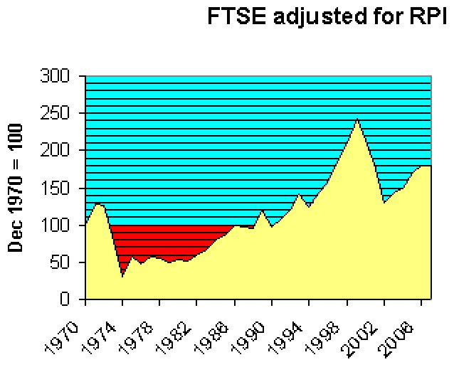
By way of comparison, here below is the result of a similar exercise for the FTSE, though I have been unable to go back further than 1970. Again, it's the close at end December each year up to 2007, adjusted in this case for RPI. FTSE stats from Wren Research, RPI from here and (for the latest 2 years) here.
The overall shape looks fairly similar to that of the Dow over the same period. Average capital gain over 37 years is c. 1.6% p.a. compounded.
Dow & S&P500 adjusted for inflation - importance of dividends

 Source: The Big Picture


Source: Inflation Data
Monday, March 31, 2008


Subscribe to:
Posts (Atom)