Tuesday, July 15, 2008
How far can the FTSE fall?
Thursday, July 10, 2008

Sunday, June 29, 2008
Investment, inflation and market collapses

 If you're an active investor, you may start thinking about opportunities. Look at the red zones. Draw a line from a deep points to a high one, and feel the greed; but draw lines from a temporary rally to another low, and feel the disappointment. You do need to get your timing right.
Thursday, June 26, 2008
The FTSE - semi-wild guesses about fair value
Using these parameters, the late 90s and early 00s were well above trend, whereas last year's highs only just peeped above the upper line and the current value is hovering a little above the centre of the hi-lo wedge.
The implications are that the next low, if it comes soon, shouldn't be worse than around 4,500, and by 2010 (when I'm guessing the tide will turn) the bracket would be in the 4,700 - 7,000 bracket, with a midpoint of c. 5,850.
Taking the market at close yesterday and extrapolating to that 5,850 midpoint, would imply a future return (ignoring dividends) over the next 16 months, of c. 2.5% p.a. - not nearly as good as cash, especially in an ISA. On the same assumptions, to achieve an ex-dividend return of 6% p.a. would require entry into the market at c. 5,400.
On this tentative line of reasoning, we should be looking for a re-entry opportunity somewhere in the 4,500 - 5,400 level, say 5,000. Shall we wait for the next shoe to drop?
Wednesday, June 25, 2008
How much of the crash is behind us?
 The FTSE is closing somewhere around 5,666.10 today. It closed at 5,709.50 on 17 February 1998, which was the first time the market had breached today's level.
 Monday, June 23, 2008
Comparisons are odious

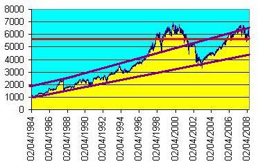
Why has the American stockmarket done so much better than us since 1990?
And which way will these lines turn now?
Wednesday, April 02, 2008
Is inflation negatively correlated with real stock values?
Obviously, this isn't exactly news - a quick Google leads me to this book by Alicia Haydock Munnell, where she says "The long-run negative correlation between stock prices and the rate of inflation has been confirmed in several statistical studies." Yet another academic study says "The bivariate results for the real stock returns-inflation pair weakly support a negative correlation in the 1970s and 1980s."
But what if we compare real stock prices with changes in the inflation rate? So I've done something childishly simple - perhaps childishly wrong, I await your correction:
First ("L2/J2"), I divided the FTSE index by the RPI index (end December figures in both cases); since the FTSE has grown in real terms by only about 1.6% p.a. since 1970, I think this should reduce some of the statistical noise - in effect, we have the inflation-adjusted value of the FTSE for each year end.
Then I looked at how much the RPI index had changed, year on year, expressed as a percentage.
Then I used Excel to calculate the correlation between the two sets of data. The figure (as you see at the bottom of the sheet) is (0.711). I may be mistaken but I think this shows that there is a strong negative correlation between changes in the inflation rate, and changes in the inflation-adjusted capital value of the FTSE.
(By contrast, the correlation between the annual percentage increase in RPI, and the annual percentage increase/decrease in the FTSE, is only 0.275576.)

Tuesday, April 01, 2008
Panic overstated?

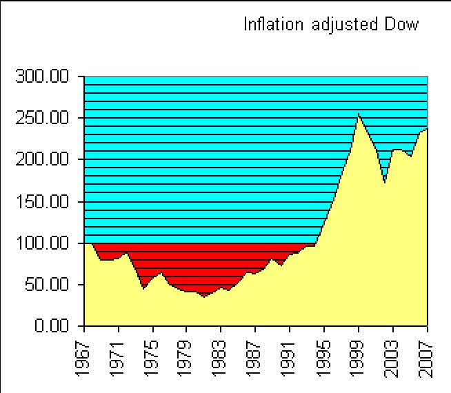
40 years on from the Summer of Love. Here's a chart I made to show the capital value of the Dow at the end of each calendar year.
I used Yahoo! for Dow valuations (ex dividends); rebased them so that Dec 1967 = 100; and adjusted for cumulative inflation as per Inflation Data's calculator.
Theoretically, someone investing a sum in the Dow at the end of 1967 would have had to wait 28 years to see it return to its original (inflation-adjusted) value.
But over the whole 40 years, the averaged return is 2.175% per annum compounded, which is very close to the 2.2% p.a. real capital growth on the S&P 500 (1871-2006) illustrated in the previous post.
These long views suggest that the Dow's recent 12-year zoom is merely a kind of rebalancing. In this context, it's interesting to see that as of September 2007, the price-earnings ratio of the S&P 500 is not far off its average over the period since 1871. The fall in stock valuations since then should have brought the p/e ratio even closer to the norm.
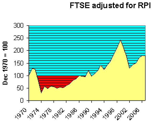
By way of comparison, here below is the result of a similar exercise for the FTSE, though I have been unable to go back further than 1970. Again, it's the close at end December each year up to 2007, adjusted in this case for RPI. FTSE stats from Wren Research, RPI from here and (for the latest 2 years) here.
The overall shape looks fairly similar to that of the Dow over the same period. Average capital gain over 37 years is c. 1.6% p.a. compounded.
Sunday, March 16, 2008
Back to 2003
I am updating expectations for this Bear Market; I no longer believe 1070 on the SPX will hold, and have now moved to the camp that sees the potential for the S&P to retrace all of the 2003-2007 Bull Market's gains, taking us back to around 800 on the SPX.
In the UK, the FTSE closed at 3,287.00 on 12 March 2003.
Friday, March 07, 2008
Ten years after the stock market bounce
Thursday, February 07, 2008
The Golden Compass doesn't work
 FTSE closed today down at 5,724.10, a point first reached (travelling the other way) in December 1998. The longer-term chart above suggests to me a glass ceiling. Or flogging a dead horse (I can't tell you how some ten-year-olds I know misheard that last saying recently, or how their conversation continued. That generation appears to be developing backwards from middle age.)
Adjusted for inflation, the line would look worse, of course. I think my gut feeling was right ten years ago: essentially, we've been going down since the late nineties.
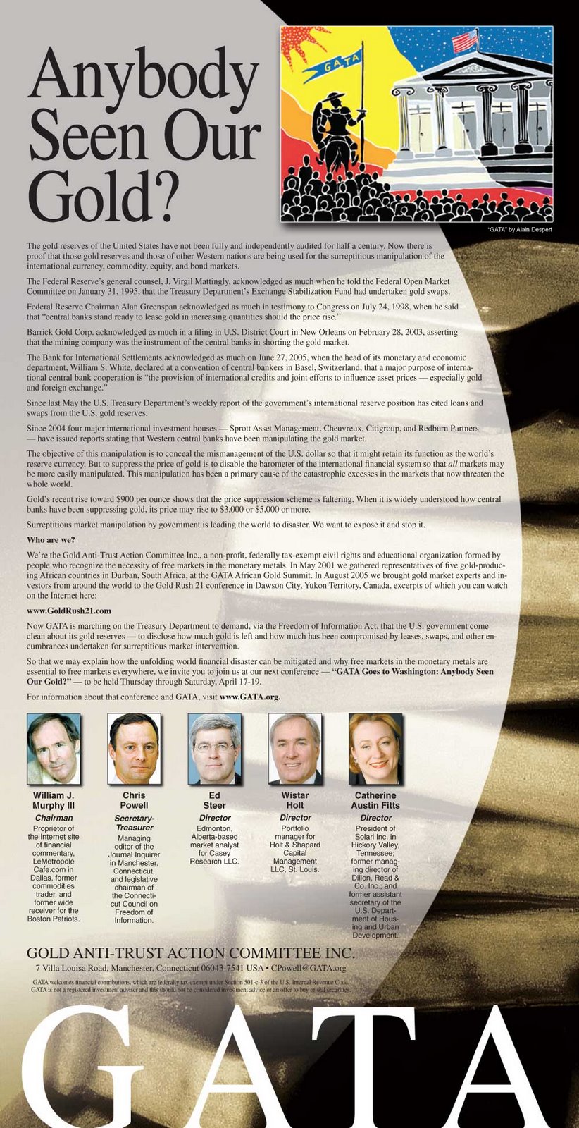
But what inflation measure to use? Gold seems to go down together with equity sell-offs, rather than seesawing against them. And unlike with the Dow, there doesn't seem to be an easily accessible index of the FTSE priced in gold terms; but GATA last week went very public with their theory that gold is being held down by surreptitious selling - and has been quietly disappearing from central bank vaults. This is something I've touched on a number of times before, and MoneyWeek gives its take on it here. Meanwhile, here's the ad:
Monday, January 21, 2008
Funny line
(Press Association release today.)
Less than 6%. Maybe they should raise the minimum age to be a trader.
Oh, and the PA uses the hack line "More than £x billion was wiped off the value of ... shares". Enough experience for cliche, not enough to remember history.
"See what I mean? Kids!"
It can't happen here
It can't happen here
It can't happen here
I'm telling you, my dear
That it can't happen here
Because I been checkin' it out, baby
I checked it out a couple a times, hmmmmmmmm
(The Mothers of Invention)
There was a period of hip journalism in the 60s and 70s that thought it clever to quote pop trash as if it were Holy Writ, and I'm afraid I couldn't resist the cheek. Retro, but maybe appropriate for a rerun of the econogrind of those years.
Friday, November 30, 2007
Something Golden This Way Comes
So the books close, the champagne flows and the rest of us can start doing our own accounts. Where are the customers' yachts?, as the naive investor asked.
Karl Denninger looks at E*Trade's difficulties and reckons the 70% mark-down of their home equity lending portfolio implies a loss of $1.5 trillion on HELOCs (home equity line of credit) alone. The bad news hasn't all come out yet.
Perhaps we entering the period of "dawning realisation".
Tuesday, November 20, 2007
Red screens
Thursday, August 16, 2007
Dow and FTSE lows
Friday, August 10, 2007
Could the Dow drop 50%?
It doesn't seem related to average income (American average earnings have grown more slowly than in the UK); if it relates to greater inequality of income, then presumably if the market turns, rich bears will be capable of pushing it down as fast as it rose. And I doubt that American multinationals have exploited subsidiaries in the Far East that much more than British-based multinationals - or have they?
Or is it money invested through the carry trade, borrowing cheaply from Japan? Then maybe it will unwind when Japanese interest rates rise. Is it the benefit of low American interest rates, thanks to huge foreign support for US Treasury securities? That love affair is coming to an end.
Let's do a thought experiment. 1987 seems a reasonable base year for our measurements, since the markets weathered the "Crash" of October and still ended up ahead by the end. From the end of 1986 to close of business this last Wednesday, the FTSE had grown by some 280%. That works out at around 6.7% capital growth compound per annum, for the whole period; add-in dividends and the reasonable investor should be satisfied.
If the Dow had done exactly the same as the FTSE, it would have grown from 1,895.95 to around 7,200. Instead, it closed on Wednesday last at 13,657.86.
Maybe there's still a lot of air in that balloon.
Thursday, August 09, 2007
Is the Dow more overvalued than the FTSE?
 I've compared the growth of the Dow and the FTSE with the increase in national annual average earnings in each country. As you see, the Dow has advanced much more rapidly.
UK earnings are calculated as 52* weekly wages. UK stats here, USA stats here. Dow and FTSE stats from the Yahoo! finance website - see sidebar.
Friday, July 27, 2007
October 1987 revisited
Let's have a look at what has happened to prices. Cliff D'Arcy in The Motley Fool (22 May 2007) does a very informative comparison between houses and the FTSE 100. He reminds us that although the FTSE-100 dropped dramatically on "Black Monday" (19 October 1987), it ended about 2% higher over the year as a whole. If we take his figures for 1987 to 2006, house prices increased 287%, and the FTSE 263%. This would suggest that house prices and stock prices have increased about equally (though houses cost money to run, whereas shares pay dividends).
Are British people over-borrowed? This Bank of England research document from September 2004 says not, in relation to house prices. Yes, debt-to-income has gone up, but interest rates are now low. And despite its name, the latest survey from UK site HousePriceCrash indicates a general belief that house prices will continue to rise in the months ahead. (But recent first-time buyers will be more vulnerable, having little equity and probably a high income multiple for their loan.)
I find the monetarist arguments intuitively persuasive, but I'm puzzled by the disparity between prices and monetary inflation. Using the UK's M4 stats, over the 78 quarters from Dec 1987 to March 2007, the average annualized increase in the money supply is about 10.48%. Compounding that figure, we get about 7 times more borrowed money in the system today than in 1987. Yet houses and shares are only 3-4 times higher.
What does seem clear is that we have borrowed more in relation to income, and this makes it even more important not to lose your job, or be hit by high interest rates. It's worrying when you have to depend on things carrying on as they are, indefinitely.
Wednesday, June 20, 2007
How far could the Dow (and FTSE) fall?
The Wall Street Crash started dramatically, but took about 3 years to complete its decline. On September 3, 1929 the Dow reached a peak at 381.17; by July 8, 1932 it stood at 41.22.
Serious, experienced analysts like Michael Panzner and Peter Schiff tell us that in some respects, the systemic financial problems we now face are indeed comparable to those times. Our advantage is that we have that history to warn us.
UPDATE
More recently, the FTSE 100 reached a peak of 6,930 on December 31, 1999 and a low of 3,287 in March 2003, as shown here. That's a drop of over 52%.
At the time of writing (5:42 pm GMT) it stands at 6,649, but you have to see this in the context of massive monetary inflation; compared with the end of 1999 in real terms, it's lost a lot of ground already. That's why I've suggested that we may already be in a bear market that is disguised by inflation. As in Alice in Wonderland, it has to run quite hard just to stay in the same place.