Thursday, April 03, 2008
Fishy business in the gold market
Contrarian Investor reports that gold is being loaned out at negative rates of interest, which he thinks is in order to help short the gold market. There's a manicured thumb on the scales, it seems.
Does asset inflation help support stock prices?
An anonymous comment on the preceding post has set me speculating further. The commentator says:
You are right, but I believe that this time around it will be equities, rather than commodities or real estate that will provide the hedge against coming inflation. Tobin's Q will prevail due to the juxtaposition of equity prices vs. the other two asset classes (which already had their surges) and the market's increasing valuation sophistication compared to the last time we saw hyperinflation in developed economies (i.e. the 1970s). So I've been buying stocks as an inflation hedge, despite the statistical evidence that this is foolish...
Wikipedia offers an explanation of Tobin's Q here. Essentially, Q is a measure of the relationship between the value of all a company's shares, and the value of the company's assets. If Q is greater than 1, there is some reason (real or imaginary) why the company has extra value to offer; if less than 1, a share investor could buy a company's underlying assets at a discount.
In 2006, Michael Alexander wrote a series of articles for Safe Haven, about stock cycles. Below, from the second in the series, is his graph for Q in several bear markets, including the one which he suggests began in 2000:
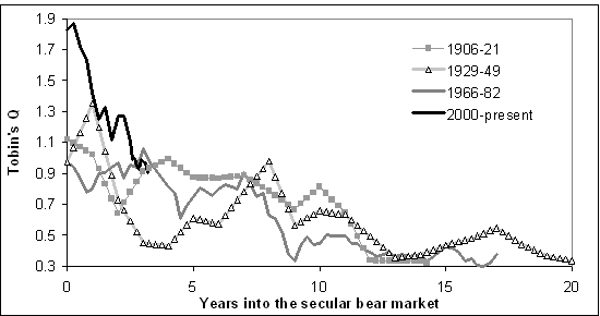
According to this, Q was already below 1 in 2006, and since the market is now back to about where it was a couple of years ago, that would suggest that shares are now fairly valued in relation to company assets.
But if history repeats itself, the current bear market has a long way to go, since the other three lasted 15 - 20 years. And in each of the previous cycles, Q slumped below 0.4.
Another complicating factor, thanks to the lending boom, is the real estate bubble. Steve Moyer is firmly of the opinion that real estate is very heavily overvalued, even now. So a collapse in that market would push Tobin's Q back up for many companies, a technical indication that share prices would have to drop steeply to get back to fair value (let alone overshoot to below Q=0.5).
In this context, it's worth noting that one of Mike Alexander's books, published in 2000, is titled "Stock Cycles: Why stocks won't beat money markets over the next twenty years".
Wednesday, April 02, 2008
Is inflation negatively correlated with real stock values?
I'm aware that I'm setting myself up to be laughed at by the quants, but I'm playing a hunch. The FTSE graphs I've done over the last couple of days suggested to me that periods of high inflation are bad news for stock prices, as well as for cash.
Obviously, this isn't exactly news - a quick Google leads me to this book by Alicia Haydock Munnell, where she says "The long-run negative correlation between stock prices and the rate of inflation has been confirmed in several statistical studies." Yet another academic study says "The bivariate results for the real stock returns-inflation pair weakly support a negative correlation in the 1970s and 1980s."
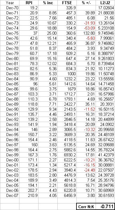
But what if we compare real stock prices with changes in the inflation rate? So I've done something childishly simple - perhaps childishly wrong, I await your correction:
First ("L2/J2"), I divided the FTSE index by the RPI index (end December figures in both cases); since the FTSE has grown in real terms by only about 1.6% p.a. since 1970, I think this should reduce some of the statistical noise - in effect, we have the inflation-adjusted value of the FTSE for each year end.
Then I looked at how much the RPI index had changed, year on year, expressed as a percentage.
Then I used Excel to calculate the correlation between the two sets of data. The figure (as you see at the bottom of the sheet) is (0.711). I may be mistaken but I think this shows that there is a strong negative correlation between changes in the inflation rate, and changes in the inflation-adjusted capital value of the FTSE.
(By contrast, the correlation between the annual percentage increase in RPI, and the annual percentage increase/decrease in the FTSE, is only 0.275576.)
Obviously, this isn't exactly news - a quick Google leads me to this book by Alicia Haydock Munnell, where she says "The long-run negative correlation between stock prices and the rate of inflation has been confirmed in several statistical studies." Yet another academic study says "The bivariate results for the real stock returns-inflation pair weakly support a negative correlation in the 1970s and 1980s."
But what if we compare real stock prices with changes in the inflation rate? So I've done something childishly simple - perhaps childishly wrong, I await your correction:
First ("L2/J2"), I divided the FTSE index by the RPI index (end December figures in both cases); since the FTSE has grown in real terms by only about 1.6% p.a. since 1970, I think this should reduce some of the statistical noise - in effect, we have the inflation-adjusted value of the FTSE for each year end.
Then I looked at how much the RPI index had changed, year on year, expressed as a percentage.
Then I used Excel to calculate the correlation between the two sets of data. The figure (as you see at the bottom of the sheet) is (0.711). I may be mistaken but I think this shows that there is a strong negative correlation between changes in the inflation rate, and changes in the inflation-adjusted capital value of the FTSE.
(By contrast, the correlation between the annual percentage increase in RPI, and the annual percentage increase/decrease in the FTSE, is only 0.275576.)

Thinking about this, it would make sense: when inflation starts roaring away, investors will want better yields on stocks, so (as with bonds) the value of stocks needs to fall. The question is, how long does it take for the dividends to compensate for the capital loss, to someone who held the shares before the major inflationary period began?
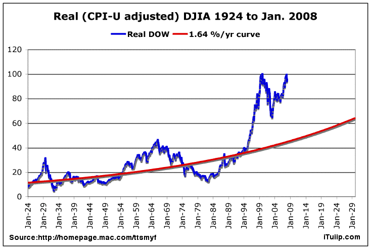
Maybe the sales line that stocks are a long-term hedge against inflation, is only half-right: it'd pay even better (when inflation begins smouldering) to switch out of cash, bonds and stocks and into other stores of value (such as commodities and houses), and come back again when the inflationary fire looks as though it's been brought under control. Look at the real capital values of the Dow and FTSE in these graphs, and imagine you had stayed out for a decade or more, then jumped in with your portfolio in the early 80s, or mid 90s.
But speculators have already gotten into commodities, and (thanks to greedy banks and lax governments) houses are massively oversubscribed. Nevertheless, commodities may yet be a better long-term punt than the average investment at this stage, and there are those who will argue the case for good agricultural land. So maybe there's still an opportunity to get on the cruise ship, even if we've missed the speedboat?
It's so difficult when, as Marc Faber says, for the first time we're in a world-wide bubble. This nasty combination of monetary and fiscal crises has us running in all directions.
UPDATE
Yes, I've got my methodology wrong, as my brother has pointed out. So I'm back to the simpler, positive (real, but not so strong) correlation between percentage changes in the FTSE and the RPI: 0.275576. Interestingly, the correlation is very slightly better (about 0.285), if you look at the FTSE 12 months ahead of the RPI.
It's just that, visually, the inflation "mountain" of the 70s and early 80s seems to want to turn upside down and fill the inflation-adjusted "crater" of the FTSE in the same period. But at least there is a definite correlation, over the series as a whole from 1971-2007.


Tuesday, April 01, 2008
Panic overstated?

40 years on from the Summer of Love. Here's a chart I made to show the capital value of the Dow at the end of each calendar year.
I used Yahoo! for Dow valuations (ex dividends); rebased them so that Dec 1967 = 100; and adjusted for cumulative inflation as per Inflation Data's calculator.
Theoretically, someone investing a sum in the Dow at the end of 1967 would have had to wait 28 years to see it return to its original (inflation-adjusted) value.
But over the whole 40 years, the averaged return is 2.175% per annum compounded, which is very close to the 2.2% p.a. real capital growth on the S&P 500 (1871-2006) illustrated in the previous post.
These long views suggest that the Dow's recent 12-year zoom is merely a kind of rebalancing. In this context, it's interesting to see that as of September 2007, the price-earnings ratio of the S&P 500 is not far off its average over the period since 1871. The fall in stock valuations since then should have brought the p/e ratio even closer to the norm.
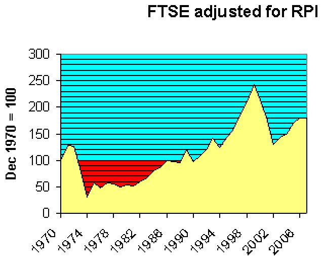
By way of comparison, here below is the result of a similar exercise for the FTSE, though I have been unable to go back further than 1970. Again, it's the close at end December each year up to 2007, adjusted in this case for RPI. FTSE stats from Wren Research, RPI from here and (for the latest 2 years) here.
The overall shape looks fairly similar to that of the Dow over the same period. Average capital gain over 37 years is c. 1.6% p.a. compounded.
Dow & S&P500 adjusted for inflation - importance of dividends

 Source: The Big Picture


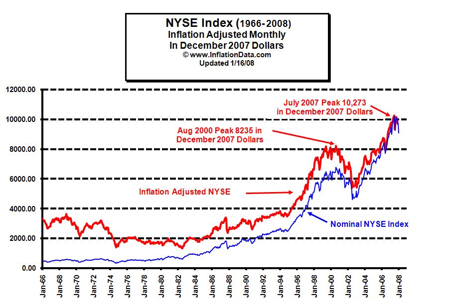
Source: Inflation Data
Subscribe to:
Posts (Atom)